
Thursday, 17 December 2009
Counter Culture
Something which cropped up in the portfolio examination we had before the unit started was that i should continue to draw characters like the 'pipe smoker' that i had presented in the meeting. I decided to set myself a little sub project to continue after the unit is over to recall memories of my friends when we were younger and turn them into A2 drawings. The first of which i have photographed below.
Midnight Millionaires


One of the highlights of the negotiated practice unit for me was participating in my first public exhibition of work as part of Holly's Midnight Millionaires club. I also managed to sell some work at the silent auction. (Photographs Courtesy of Holly - pinched from facebook)
Black cat number 13
 Throughout the book virtually everyone who comes into contact with Jean-Baptiste encounters some kind of misfortune, in fact most of the characters (once their role in the narrative comes to an end) die in the most unlucky fashion. I wanted to create a single image that quite simply summed up the fact that the man carries with him a curse that spreads "misfortune and death". I think that this of all my prints is the most successful, it is eye catching yet doesn't give too much away. I think this will most probably be the image i choose to submit to the competition.
Primitive Drawing
Throughout this project i have tried to draw influence from a number of different sources, Including Aboriginal art and primitive and naive drawing, a lot of my sketchbook work has involved mark making and an attempt to absorb the styles from a number of different cultures to create something different of my own. The reason why i think that primitive drawing works in application to this text in particular is that Jean-Baptiste is the only one of his kind, and an other to the rest of society, and at times could be considered savage. The Primitive also links in well with the superstitiousness of the 18th century and the exoticism associated with perfumery.


Typography
 My focus for this project has been mainly on drawing and not on hand generated type, even so i have considered its application for this brief and tried out a few ideas. The basic idea for this woodcut font was for each of the letters to be constructed from one of the ingredients of the formula he smells on his first victim. The flower forming the P is Jasmine.
Smellovision
I decided to use this cross section of an apple with a worm in it to describe Jean-baptistes ability to detect things with smell, like a 6th sense, things not visible to the naked eye. I discussed the possibility in tutorial of combining the various elements i have put together into one illustration like a storyboard or a sheet of tattoo flash (linking back to the Russian criminal tattoo) but in the end decided to keep them seperate on the basis that compressed down to paperback format/ roughly A5 the individual prints would lose their impact.


Ballast
Another bit of the book that stuck with me was the dispassionate way Jean-baptiste discards the bodies of his victims having savoured every last drop of their scent. There is a deliberate comparison between the worthless pulp at the bottom of the alembic and what is left of the women after he has finished. With this image i wanted to make a visual comparison between an empty husk and the bodies of the victims, as if what was valuable had been extracted, leaving behind only waste.


With this image i wanted to make a visual comparison between an empty husk and the bodies of the victims, as if what was valuable had been extracted, leaving behind only waste.
Faces
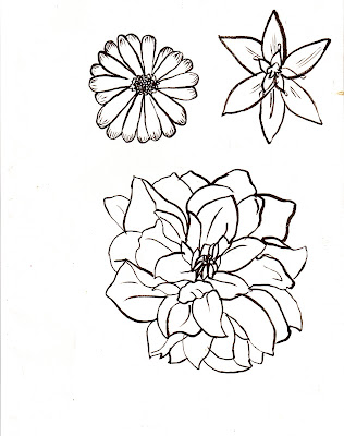
The brief on the Penguin Design Award site recommended using a human element in the illustration to make it easy to identify with and so i decided to try and dedicate part of my time to generating a style of drawing figure that would be individual and distinctive with the intention of including this in one of my final pieces. Below are some examples of my character drawings, again some of my inspiration for these has been drawn from the 60's and 70's covers from the 700 Penguins book and from the work of Ralph Steadman and Raymond Pettibon.


Natural dyes
 One thing that came up during tutorials was that my work is often monochromatic and i think it would be fair to say that i shy away from using colour. Having taken this into account I tried to think of ways of bringing colour into my work that would be fitting specifically for this project. The result was making natural dyes for coloured paper from onion skin, sage leaves and saffron. I wanted to do try making colours from scratch the way a perfumer captures essential oils from raw materials.
Leech
 During the course of reading the text i have tried to identify themes that recur throughout the narrative, one of these is the narrators comparison between protagonist and parasite. Something about the parasitic nature of Jean-Baptiste and the virginal purity of his victims led me to think of the William Blake poem the 'sick rose'
O Rose thou art sick.
The invisible worm,
That flies in the night
In the howling storm:
Has found out thy bed
Of crimson joy:
And his dark secret love
Does thy life destroy.
as well as having content that links subtly with the text, William Blake was also a print maker and illustrator from around the time that Perfume is set (the poem was written in 1789). I used the illustrations from songs of innocence and of experience for inspiration as well as continuing to look into forms of primitive drawing. The finished drawing of the leech surrounding the white flower is supposed to represent the predator and its prey, the white flower is symbolic of purity and virginity, and the leech is the parasite - Jean Baptiste.

Fishmonger
In the book the main characters mother is a fishmonger, when she gives birth to him she cuts the cord with her fish gutting knife and abandons the child. At the time of drawing i had been looking at a copy of the "Russian Criminal Tattoo Encyclopedia" I quite like the way that a persons life story can be told through tattoo using symbols and keys, so i wanted to create my own symbols for the events they represented as if they were to be worn by Jean-Baptiste.


Perfume
The focus on the first chapter, and the one thing which stuck with me from the first part of the book was the way the author describes Paris in the 1800's particularly the emphasis on scale and just how bad the city smelt. I wanted to try and recapture the complicated and overpowering collection of odours by creating an image that was similarly visually busy. I started by looking at photographs of Paris from the mid to late 1800s as much of the architecture would have looked the same around the time the novel was set (particularly around the Ile De La Cite). I had also been to the Museum of Everything as part of our London study trip and was intrigued by the drawings of Leonhard Fink particularly because of their child like quality, and visual similarity with art brut/ savant artists etc. I liked the idea of attempting to approach the images from the perspective of the books protagonist (He is outside of ordinary society in a similar way a schizophrenic might be and naive drawing as a visual approach could work well).


I chose to try and keep printmaking central to this project for two reasons; firstly because a lot of the book illustration from the time the novel is set would have been wood engraving (very similar aesthetically to lino) and also because it is a skill which, as i have stated before, I would like to develop.


I chose to try and keep printmaking central to this project for two reasons; firstly because a lot of the book illustration from the time the novel is set would have been wood engraving (very similar aesthetically to lino) and also because it is a skill which, as i have stated before, I would like to develop.
Negotiated Practice


The live brief that i chose to adopt for the bulk of my negotiated practice unit was the Penguin Design Awards competition to re-design the cover of Patrick Suskind's Perfume. The first thing i did to begin researching was to look into penguins brand identity via the book "Seven Hundred Penguins" which shows a fairly comprehensive history of cover design from the publishers conception to now, and the second was to buy the text itself. I also have a number of old penguin books with covers I have looked to for inspiration during this project. To begin image generation i chose to select excerpts of text that i thought would be particularly strong visually and create a body of work from which I could draw my finals.
http://www.penguin.co.uk/nf/Book/BookDisplay/0,,9780141031880,00.html
Experimental Printmaking Short Course
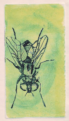
At the beginning of the summer holidays i chose to sign up for a short course on printmaking at AUCB. It had been a focus of interest for me some time, and one of the aspects of illustration and image making that I have always enjoyed the most. For the first part it involved going over old ground and experimenting with mark making and the various print mediums but we eventually came to prepare some finished pieces of work in the last few weeks. I have included some examples of some of my prints; Lino cut, intaglio/relief, perspex etching and solar etching (in descending order). I think this course confirmed for me that printmaking is something that i would like to continue to pursue as part of my professional practice and possibly also for post-graduate study.


For my work experience in the summer I spent a week in the design department at David and Charles publishing house. Aside from the obvious benefits of tasting the real world of work outside of the university it also provided a week of intensive I.T training in all the various software packages that publishers now use, which for an aspiring book illustrator was invaluable. I have included below an example brief that i was given for brainstorming logo ideas for the marketing department (unfortunately i now only have the printouts and not the original illustrator files). As well as these few creative briefs i became familiar with the real donkey work that goes on at a publishers i.e. copying out diagrams, proof reading ozalids for copy errors and data entry.


Subscribe to:
Comments (Atom)